Introduction
Welcome to CozyNestDecor, where we believe your home should be a reflection of your most authentic self. In the vast and sometimes overwhelming world of home design, few decisions carry as much weight and transformative power as the selection of your home’s color palette. It’s the silent language of your space, setting the mood, influencing perception, and weaving together every element of your decor. Whether you’re drawn to the serene calm of coastal blues or the vibrant energy of bohemian jewel tones, the right color palette is the foundational key to creating a home that feels both stylish and deeply personal.
This definitive guide is designed to be your comprehensive roadmap, demystifying the process and empowering you to choose and implement a color palette that will make you fall in love with your home all over again. Let’s dive in.
Chapter 1: The Fundamentals of Color Theory
Before we browse paint swatches or fabric samples, it’s crucial to understand the basic principles of color theory. This is the grammar of the visual language you’re about to speak.
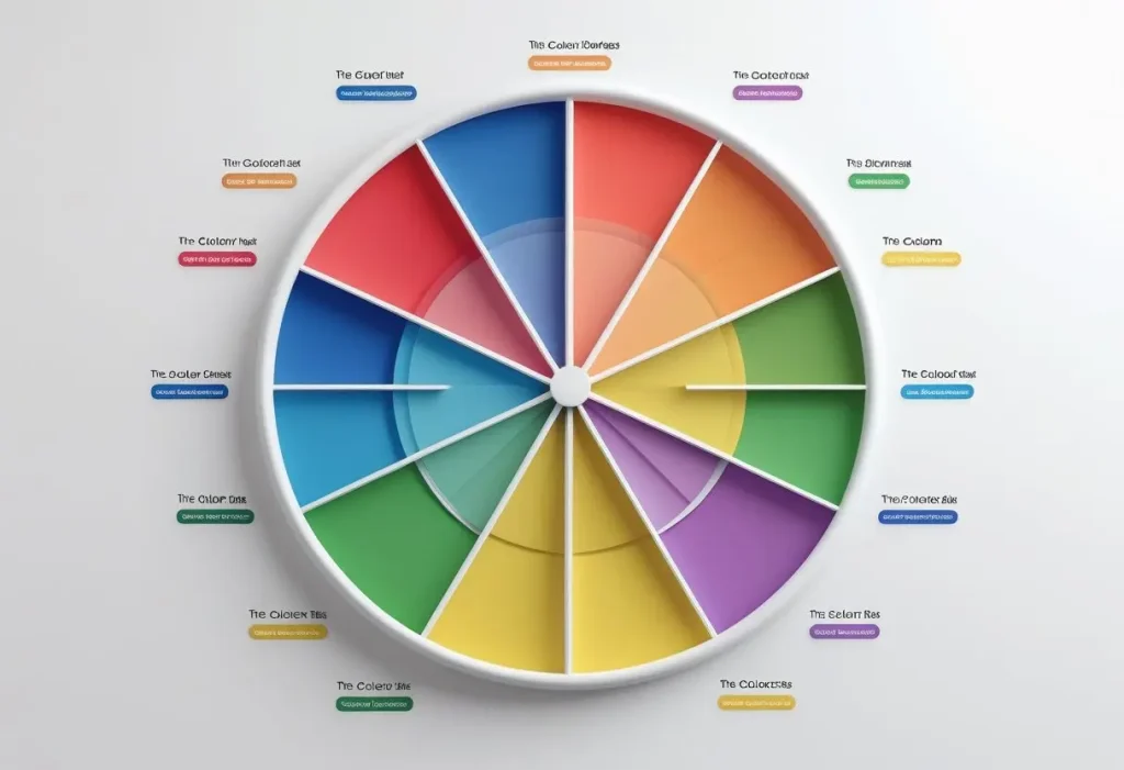
The Color Wheel: Your Essential Tool
The color wheel is a circular diagram of colors arranged by their chromatic relationship. It’s the single most important tool for creating a harmonious color palette.
- Primary Colors: Red, blue, and yellow. These are the pigment colors that cannot be created by mixing other colors.
- Secondary Colors: Green, orange, and purple. These are created by mixing two primary colors.
- Tertiary Colors: Red-orange, yellow-orange, yellow-green, blue-green, blue-purple, and red-purple. These are created by mixing a primary color with a secondary color.
Understanding Color Temperature
Colors are psychologically categorized as either warm or cool, which drastically affects the feel of a room.
- Warm Colors (Reds, Oranges, Yellows): These colors are energetic, vibrant, and stimulating. They tend to advance in a space, making large rooms feel more intimate and cozy. Think of the warmth of a terracotta pot or a golden sunset.
- Cool Colors (Blues, Greens, Purples): These colors are calming, serene, and spacious. They tend to recede, making small rooms feel larger and airier. Think of the chill of a sea glass or a lush forest canopy.
Core Color Palette Harmony Schemes
Using the color wheel, you can create several classic and foolproof color palette harmonies.
1. Monochromatic Color Palette
This scheme uses variations in lightness and saturation of a single base color. It’s inherently harmonious, serene, and easy on the eyes. To prevent it from feeling flat, incorporate a variety of textures.
- Example: A living room featuring navy blue walls, a sky blue sofa, and steel blue throw pillows, all in different textures like velvet, linen, and wool.
2. Analogous Color Palette
This scheme uses colors that are next to each other on the color wheel. It’s as easy to create as a monochromatic scheme but offers more visual interest while remaining pleasing to the eye.
- Example: A serene bedroom using blue, blue-green, and green, evoking a calm, natural feeling.
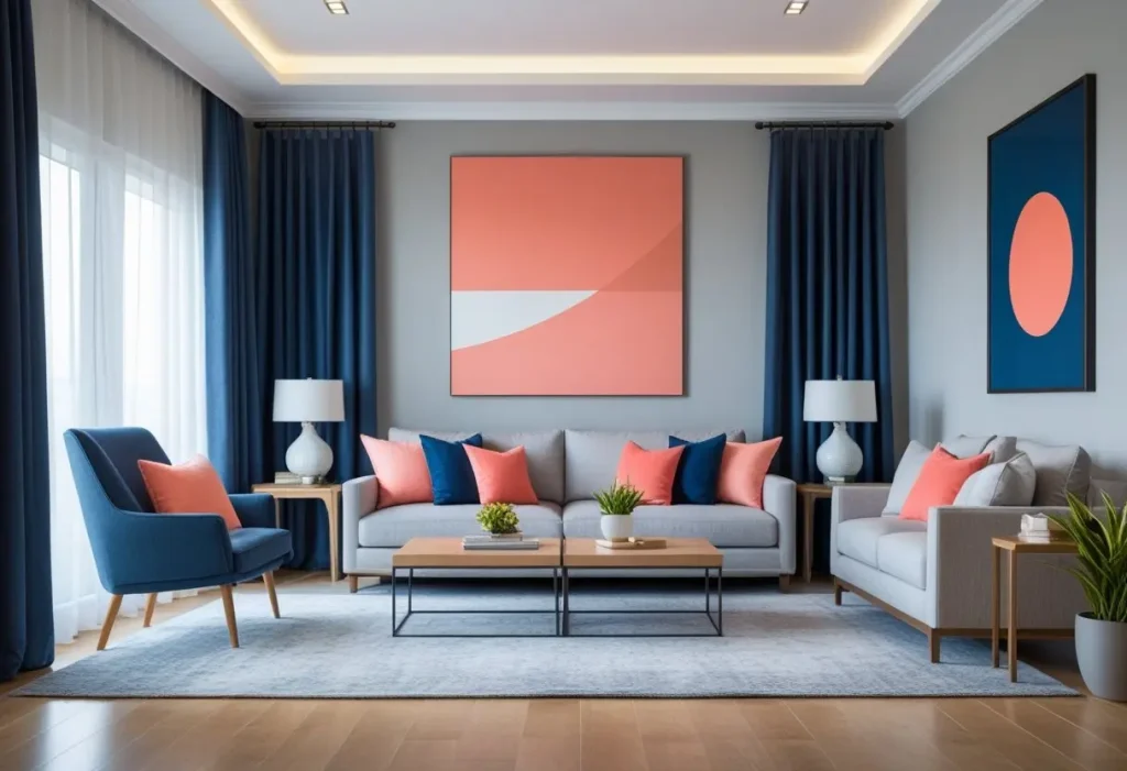
3. Complementary Color Palette
This high-impact scheme uses two colors that are opposite each other on the color wheel. The strong contrast creates a vibrant, dynamic look that is full of energy. Use this scheme carefully, letting one color dominate and the other serve as an accent.
- Example: A vibrant home office with deep blue walls and pops of bright orange in the artwork and desk accessories.
4. Triadic Color Palette
This scheme uses three colors that are evenly spaced around the color wheel. It offers a rich, vibrant contrast while retaining balance and harmony. It’s bold but requires careful management of color proportions.
- Example: A playful children’s playroom using the primary triadic scheme of red, blue, and yellow.
Chapter 2: The Psychology of Color in Your Home
Color is not just visual; it’s emotional. The color palette you choose for each room can directly influence your mood and well-being.
The Emotional Impact of Key Colors
- Blue: The color of calm and stability. It lowers heart rate and reduces anxiety. Ideal for bedrooms, bathrooms, and home offices where focus and relaxation are key.
- Green: The most restful color for the human eye, it symbolizes nature, growth, and harmony. It works beautifully in almost any room, especially living rooms and studies.
- Yellow: The color of sunshine, optimism, and happiness. It can energize a space like an entryway or kitchen, but use softer shades to avoid creating feelings of frustration or anxiety.
- Red: A powerful, stimulating color that raises energy levels, heart rate, and even appetite. It’s a great choice for dining rooms but can be overwhelming in bedrooms.
- Purple: Long associated with royalty, luxury, and creativity. Lighter lavenders are calming for bedrooms, while deeper eggplants add drama and sophistication to living areas.
- Neutral (White, Grey, Beige): These colors provide a sense of calm, cleanliness, and spaciousness. They are the perfect backdrop for any color palette, allowing your furniture and art to take center stage.
Choosing a Color Palette Based on Room Function
Align your color palette with how you use the space.
- Living Room: A social hub that benefits from warm, welcoming, and versatile colors like warm neutrals, soft greens, or muted blues.
- Bedroom: A sanctuary for rest. Opt for calming, cool, and soothing colors like pale blues, lavenders, sage greens, and soft greys.
- Kitchen: A space of energy and nourishment. Consider cheerful yellows, warm reds, or crisp, clean whites and blues.
- Home Office: Needs to promote both focus and creativity. Greens and blues are excellent for concentration, while a pop of yellow or orange can spark innovation.
- Dining Room: A place for gathering and conversation. Rich, deep colors like burgundy, navy, or emerald green can create an intimate, luxurious atmosphere.
For more room-specific inspiration, explore our [Home Office Decor] category.
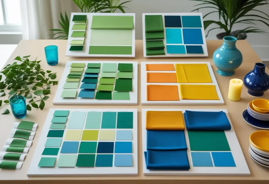
Chapter 3: A Practical Guide to Choosing Your Color Palette
Now for the actionable part. How do you go from inspiration to a fully-realized color palette for your home?
Step 1: Find Your Inspiration
Your perfect color palette can come from anywhere. Look at a favorite piece of art, a cherished rug, a beautiful landscape photograph, or even a fashion magazine. Pinterest is an excellent tool for this; start pinning images you’re drawn to and you’ll soon see a pattern emerge.
Step 2: Consider the Fixed Elements
Look at what you can’t (or don’t want to) change. This includes flooring, countertops, large furniture pieces, and fixed cabinetry. Your color palette needs to complement these elements, not fight against them.
Step 3: The 60-30-10 Rule: A Designer’s Secret
This is a timeless decorating rule for creating a balanced color palette.
- 60% Dominant Color: This is the main color used on walls, large area rugs, and perhaps a sofa. It sets the overall tone of the room.
- 30% Secondary Color: This color supports the main one and is used on upholstery, accent chairs, curtains, and bedding.
- 10% Accent Color: This is the “pop” of color used for visual interest on throw pillows, artwork, vases, and other small accessories.
Step 4: Test, Test, Test!
Paint looks dramatically different on a small swatch versus an entire wall, and it changes throughout the day with the light.
- Paint Large Swatches: Paint at least a 2×2 foot area on multiple walls (both in light and shadow).
- Live With It: Observe the color at different times of day—morning, noon, and night—with both natural and artificial light.
Step 5: Create Flow with a Whole-House Color Palette
While each room can have its own personality, creating a sense of flow between adjacent spaces is key. You can achieve this by:
- Using a consistent neutral throughout and changing the accent colors room by room.
- Using different shades of the same color in connecting spaces.
- Using an analogous color palette that subtly shifts from one room to the next.
Chapter 4: Trending Color Palettes for 2025 and Beyond
While personal taste should always reign supreme, being aware of trends can provide fresh inspiration. Here are the emerging color palette trends forecasted by leading design authorities like [Sherwin-Williams Color Forecast] and [Pantone Color Institute].
1. Earthy and Organic
A continued desire for connection to nature drives this trend. Think rich, saturated earth tones like terracotta, ochre, olive green, and deep clay reds. These colors feel grounded, warm, and comforting.
2. Tranquil and Spa-Like
As our homes become sanctuaries, colors that promote tranquility are paramount. This color palette features soft, hazy blues, gentle lavenders, pale greens, and warm, chalky whites. It’s all about creating a restful retreat.
3. Nostalgic and Warm
A trend that looks to the past for comfort, featuring warmer, creamier neutrals over cool greys. Think buttery yellows, rosy beiges, and soft, peach-toned pinks. This color palette feels optimistic and cozy.
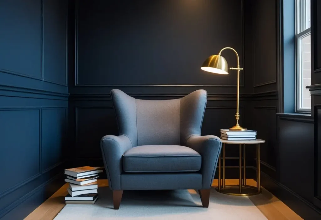
4. Bold and Expressive
For the color-confident, this trend is all about maximalism and personality. Deep, dramatic hues like cobalt blue, emerald green, and even black are being used on walls and ceilings to create intimate, jewel-box rooms.
Chapter 5: Room-by-Room Color Palette Ideas
Let’s apply everything we’ve learned to specific spaces in your home.
The Living Room Color Palette
- Warm & Inviting: Beige walls, a chocolate brown leather sofa, and accents of burnt orange and terracotta.
- Calm & Collected: A soft grey-blue on the walls, white trim, a light grey sofa, and accents in navy and mustard yellow.
The Bedroom Color Palette
- Serene Escape: Walls in a pale sage green, crisp white bedding, and natural wood accents.
- Moody & Romantic: Deep plum or charcoal grey walls, luxurious velvet textiles in silver or blush pink, and brass lighting.
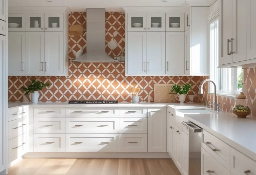
The Kitchen Color Palette
- Bright & Airy: White or light grey cabinets, a marble-look quartz countertop, and a subway tile backsplash. Accent with black hardware and wooden stools.
- Warm & Modern: Navy blue or forest green lower cabinets, white upper cabinets, warm brass hardware, and a butcher block countertop.
The Home Office Color Palette
- Focused & Productive: A deep green accent wall behind the desk, light beige on the other walls, a dark wood desk, and cognac leather accessories.
- Creative & Energetic: White walls, a large, colorful abstract painting, a yellow velvet armchair, and pops of color in organization bins.
Discover more focused ideas in our [DIY Home Decor] section, where you can learn to build and paint your own desk to match your perfect color palette.
The Bathroom Color Palette
- Spa-Like Oasis: All white with different textures (tile, wood, linen), with a single accent of sea glass green in the towels or a piece of art.
- Vintage Charm: Black and white hexagonal tile, walls in a soft powder blue, and classic chrome fixtures.
Chapter 6: Advanced Color Palette Techniques
Once you’ve mastered the basics, these advanced techniques can add depth and sophistication to your space.
Working with Lighting
Lighting can make or break your color palette.
- Natural Light (North-facing): Has a cool, blue cast. Warm up your color palette with yellows, reds, and warm neutrals.
- Natural Light (South-facing): Has a warm, yellow cast. You can use both cool and warm colors effectively.
- Artificial Light: Incandescent bulbs enhance warm tones and mute cool ones. LED bulbs can be tuned to different color temperatures—choose “warm white” for living areas and “cool white” for task lighting.
Incorporating Texture and Pattern
A monochromatic or neutral color palette relies heavily on texture to create interest. Combine smooth (glass, polished metal), rough (jute, raw wood), soft (velvet, shearling), and nubby (linen, bouclé) textures. Patterns are a great way to introduce multiple colors from your color palette in a dynamic way.
Using an Accent Wall
An accent wall is a fantastic way to introduce a bold color without overwhelming a space. The key is to paint the wall you want to highlight, like the wall behind your bed or sofa. Consider using a different texture, like shiplap or wallpaper, for even more impact.
The Fifth Wall: Your Ceiling
Don’t neglect your ceiling! Painting it a soft version of your wall color can make a room feel cozier. Painting it a stark white can make it feel higher. For a dramatic effect, use a dark color or even a glamorous metallic finish.
Chapter 7: Digital Tools for Color Palette Creation
Leverage technology to take the guesswork out of the process.
- Paint Company Apps: Brands like Sherwin-Williams, Benjamin Moore, and Behr offer apps where you can upload a photo of your room and “paint” the walls virtually to test colors.
- Online Color Palette Generators: Tools like [Coolors.co] allow you to generate endless color palette ideas with the click of a spacebar. You can lock colors you like and adjust the harmony.
- Pinterest and Instagram: Follow hashtags like #colorpaletteinspiration or #homedecorcolor to see real-life examples from other homeowners and designers.
Chapter 8: Common Color Palette Mistakes and How to Avoid Them
- Ignoring Undertones: This is the #1 mistake. Beige can be pinky, yellow, or green. Grey can be blue, purple, or green. Always compare swatches to a true white to see the undertone.
- Not Testing in the Space: The lighting in the store is not the lighting in your home. Always test samples in your actual space.
- Playing It Too Safe: Don’t be afraid of color! Even a small pop of a bold hue in your color palette can bring a room to life. Start with accessories if you’re nervous.
- Forgetting the Flow: Creating a home with jarring color transitions from room to room can feel chaotic. Use the whole-house color palette strategies mentioned earlier.
Chapter 9: Color Palette for Small Spaces vs. Large Spaces
- Small Spaces: Light, cool colors (soft blues, greens, lavenders, light greys) will make a room feel more open and airy. Use mirrors to reflect light and the chosen color palette.
- Large Spaces: You have more freedom. Dark, warm colors can make a cavernous room feel more intimate and cozy. Don’t be afraid to go bold.
For more space-saving decor that complements your color palette, check out our [Amazon Home Decor] finds.
Conclusion: Your Home, Your Masterpiece
Choosing a color palette for your home is a deeply personal and creative journey. It’s not about following rigid rules, but about understanding the principles so you can confidently break them to create a space that is uniquely and wonderfully yours. It’s about translating feeling into form, mood into color. Remember, paint is one of the most transformative and cost-effective tools at your disposal. So take a deep breath, trust your instincts, and embrace the process. Your perfect color palette is out there, waiting to turn your house into a CozyNest.
Ready to start your next project? Browse our [DIY Home Decor] category for step-by-step guides on painting furniture, creating accent walls, and more!
Frequently Asked Questions (FAQ)
Q1: What is a color palette in interior design?
A: In interior design, a color palette is a carefully selected range of colors used to create a specific mood, style, and sense of harmony throughout a space. It typically consists of a dominant color, secondary colors, and accent colors that work together cohesively.
Q2: How do I choose a color palette for my whole house?
A: Start by choosing a palette of 3-5 core colors you love. Use a consistent neutral (like a warm white or beige) in connecting spaces, and then pull different accent colors from your core palette for individual rooms. This creates a sense of flow while allowing each room its own character.
Q3: What is the 60-30-10 rule for a color palette?
A: The 60-30-10 rule is a classic design principle for achieving balance. Use 60% of a dominant color on walls and large furnishings, 30% of a secondary color on upholstery and curtains, and 10% of an accent color on accessories, art, and small decor items.
Q4: How does lighting affect my color palette?
A: Lighting is crucial. Natural north light casts cool, blue tones, making warm colors look better. South light is warm and can handle both cool and warm palettes. Artificial light also changes color; incandescent bulbs warm colors, while some fluorescents can cool them. Always test paint samples in the room’s actual light.
Q5: What are some popular color palettes for a living room?
A: Popular living room color palettes include calming blues and greys, warm and inviting beiges and terracottas, serene greens and neutrals, and sophisticated monochromatic schemes in shades of grey or beige.
Q6: Can I use a different color palette in every room?
A: Yes, you can, but for a cohesive feel, it’s best to create visual connections. This can be done by carrying one color throughout (e.g., using the same white trim everywhere), or by using analogous colors that blend well from one room to the next.
Q7: What is the best color palette for a small room to make it look bigger?
A: To make a small room look bigger, use a light, monochromatic or analogous color palette with cool tones like soft grey, pale blue, or light green. Using the same color on walls, trim, and ceilings can also help blur boundaries and expand the space visually.
Q8: How many colors should be in a color palette?
A: A typical room color palette has 3-5 colors: a dominant, a secondary, 1-2 accents, and often a neutral. For a whole-house palette, you might have 5-7 core colors that you mix and match in different combinations from room to room.
Q9: Where can I find inspiration for my color palette?
A: Inspiration is everywhere! Look to nature, art, fashion, photography, and travel. Online platforms like Pinterest and Instagram are fantastic resources. You can also use digital tools like color palette generators (e.g., Coolors.co) for endless ideas.
Q10: What are the common mistakes to avoid when choosing a color palette?
A: Common mistakes include not testing paint samples in the actual space, ignoring the undertones of colors, creating a palette that clashes with fixed elements (like flooring), and not considering the flow of color from one room to another.
Q11: How do I incorporate bold colors into my color palette without it being overwhelming?
A: Start small. Use bold colors as the 10% accent in your 60-30-10 rule. Paint a single piece of furniture, use colorful throw pillows and blankets, or hang large, vibrant artwork. An accent wall is also a great way to introduce a strong color confidently.
Q12: What are the trending color palettes for the upcoming year?
A: Trends are shifting towards earthy, organic palettes (terracotta, olive green), tranquil spa-like hues (hazy blue, pale green), nostalgic warm neutrals (creamy beige, rosy tan), and bold, expressive dark colors (navy, charcoal, emerald) for creating cozy, intimate spaces.